This is some text inside of a div block.
This is some text inside of a div block.
This is some text inside of a div block.
This is some text inside of a div block.
This is some text inside of a div block.
This is some text inside of a div block.
This is some text inside of a div block.
This is some text inside of a div block.
This is some text inside of a div block.
This is some text inside of a div block.
This is some text inside of a div block.
This is some text inside of a div block.
This is some text inside of a div block.
This is some text inside of a div block.
This is some text inside of a div block.
This is some text inside of a div block.
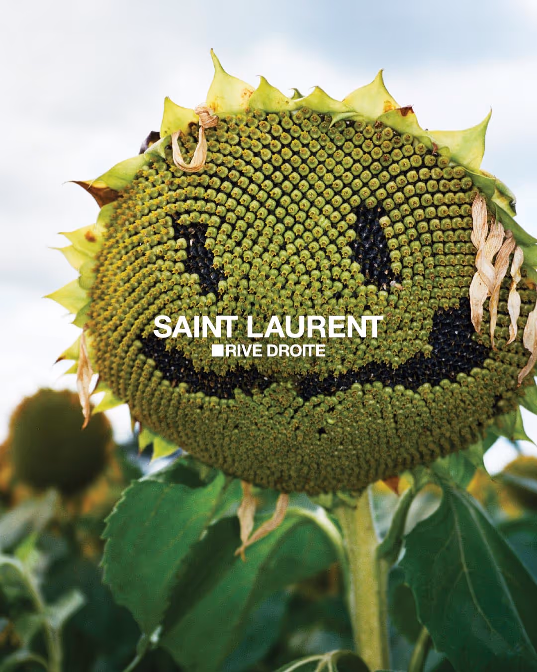
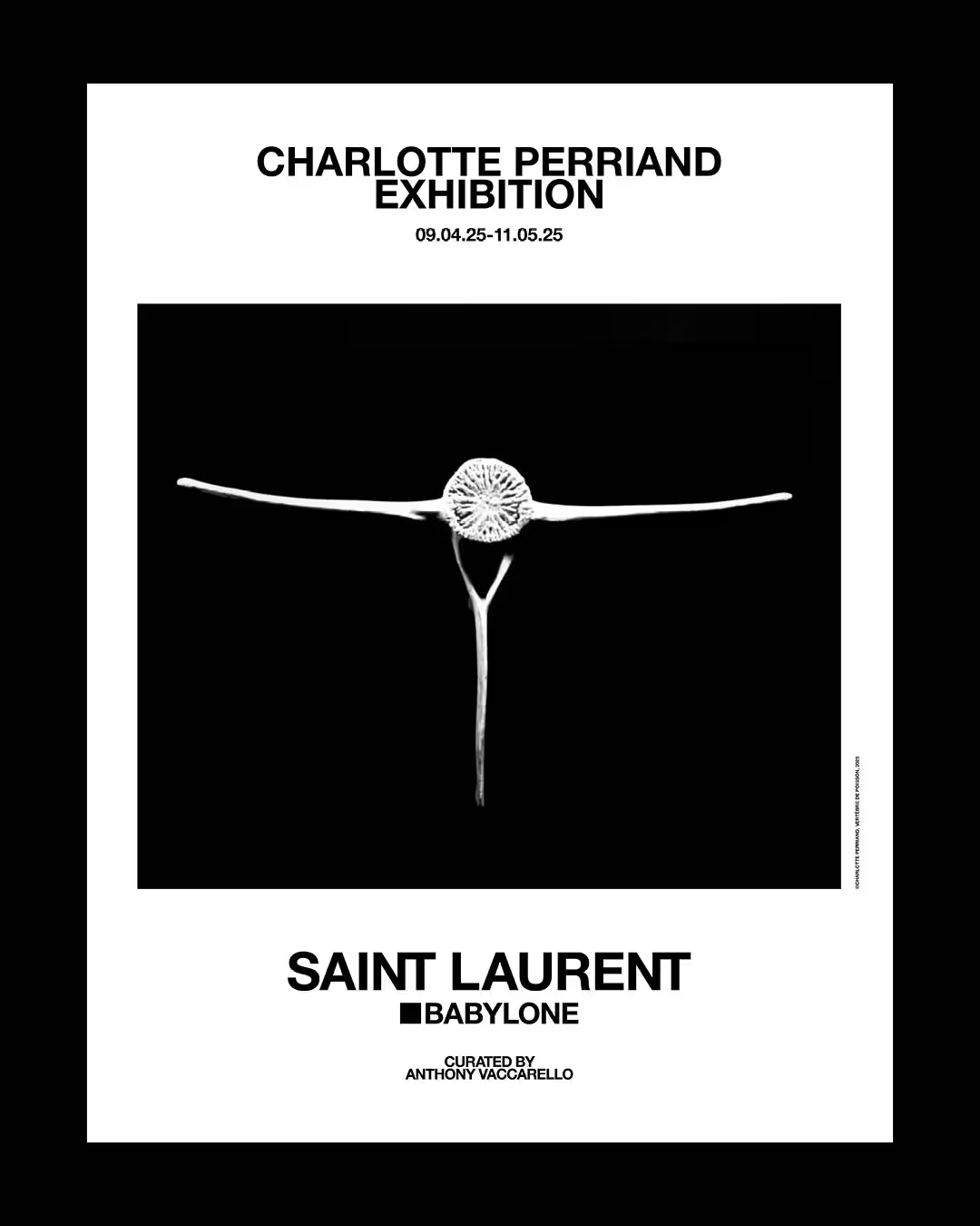
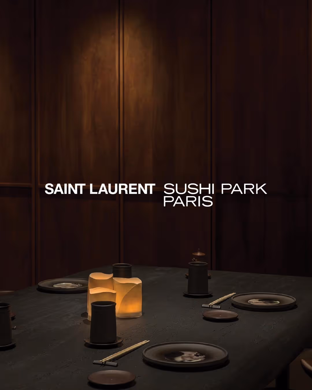
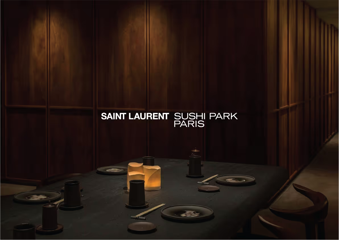
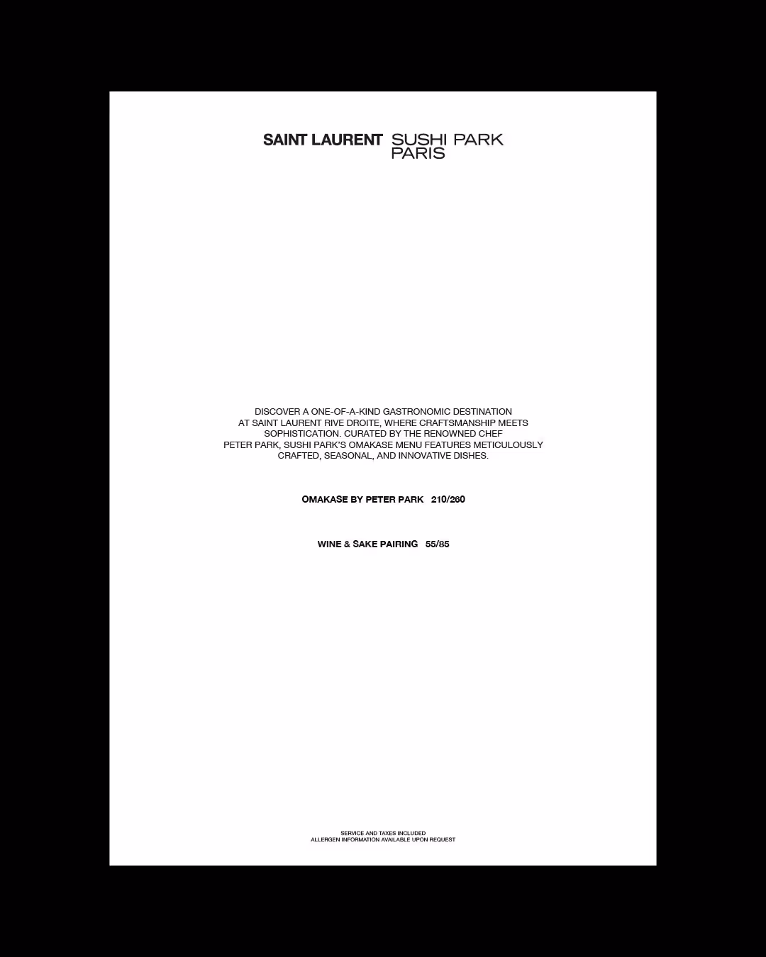
03. Saint Laurent Sushi Park
→ Identity / Print & Digital
A collaboration identity aligning Sushi Park’s reconstructed custom type with Saint Laurent’s graphic system.
Brand collaborations often require distinct visual identities to coexist within a shared framework.
For the Saint Laurent Rive Droite collaboration with Sushi Park, the restaurant’s original logo needed to integrate with Saint Laurent’s graphic language.
The project explores how typographic reconstruction can align two identities while preserving their character.
For the Saint Laurent Rive Droite collaboration with Sushi Park, the restaurant’s original logo needed to integrate with Saint Laurent’s graphic language.
The project explores how typographic reconstruction can align two identities while preserving their character.
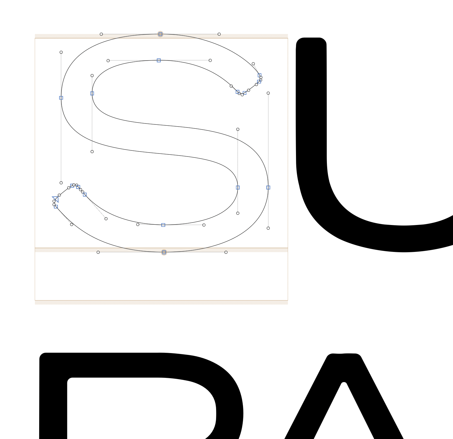
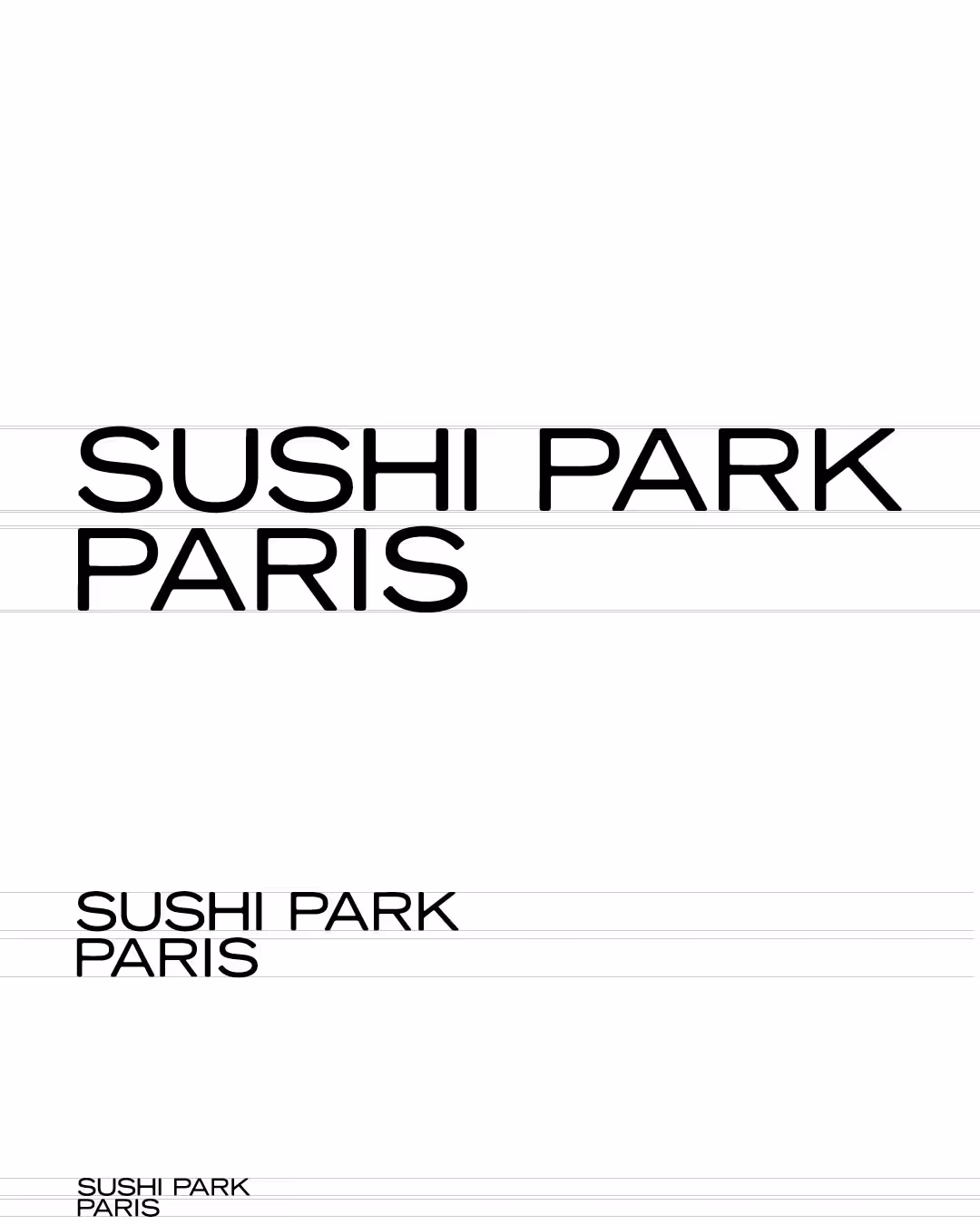
Sushi Park’s identity relies on expressive hand-drawn lettering.
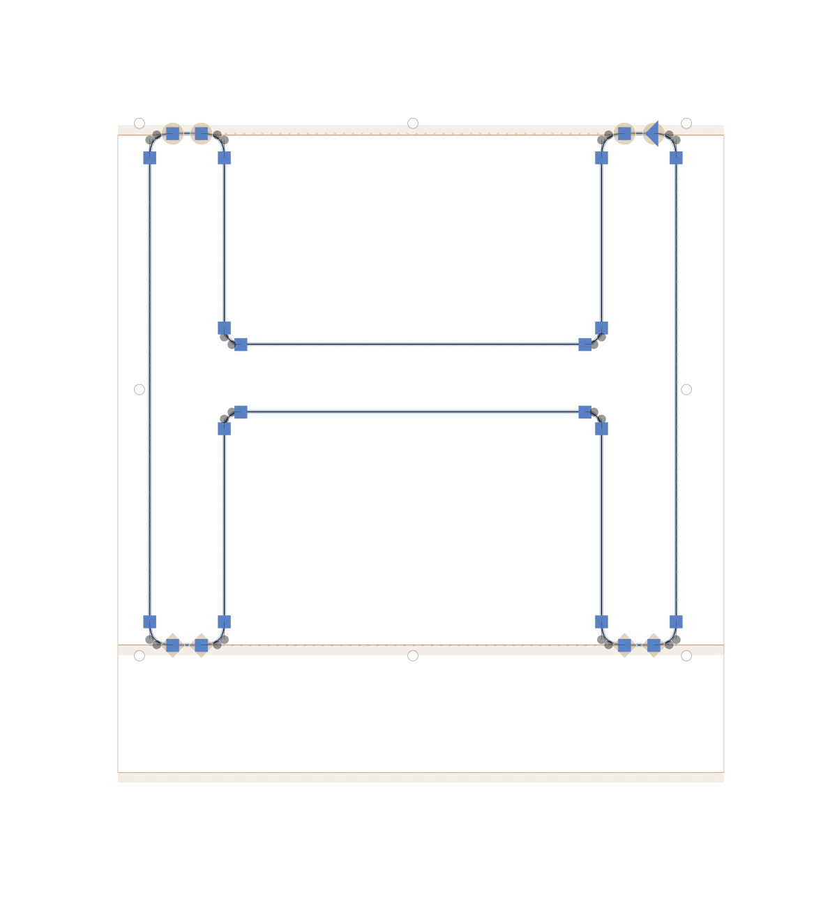
The original mark was reconstructed and refined
This process stabilizes the lettering while maintaining
the character of the original logo.

Authenticity → Reconstruction of Sushi Park’s custom type
Precision → Vector typographic refinement
Dialogue → Co-logo structure
Restraint → Minimal menu layout
Balance → Alignment with Rive Droite visual language

Custom type reconstruction
Vector lettering refinement
Co-branded logo lockup
Minimal menu design
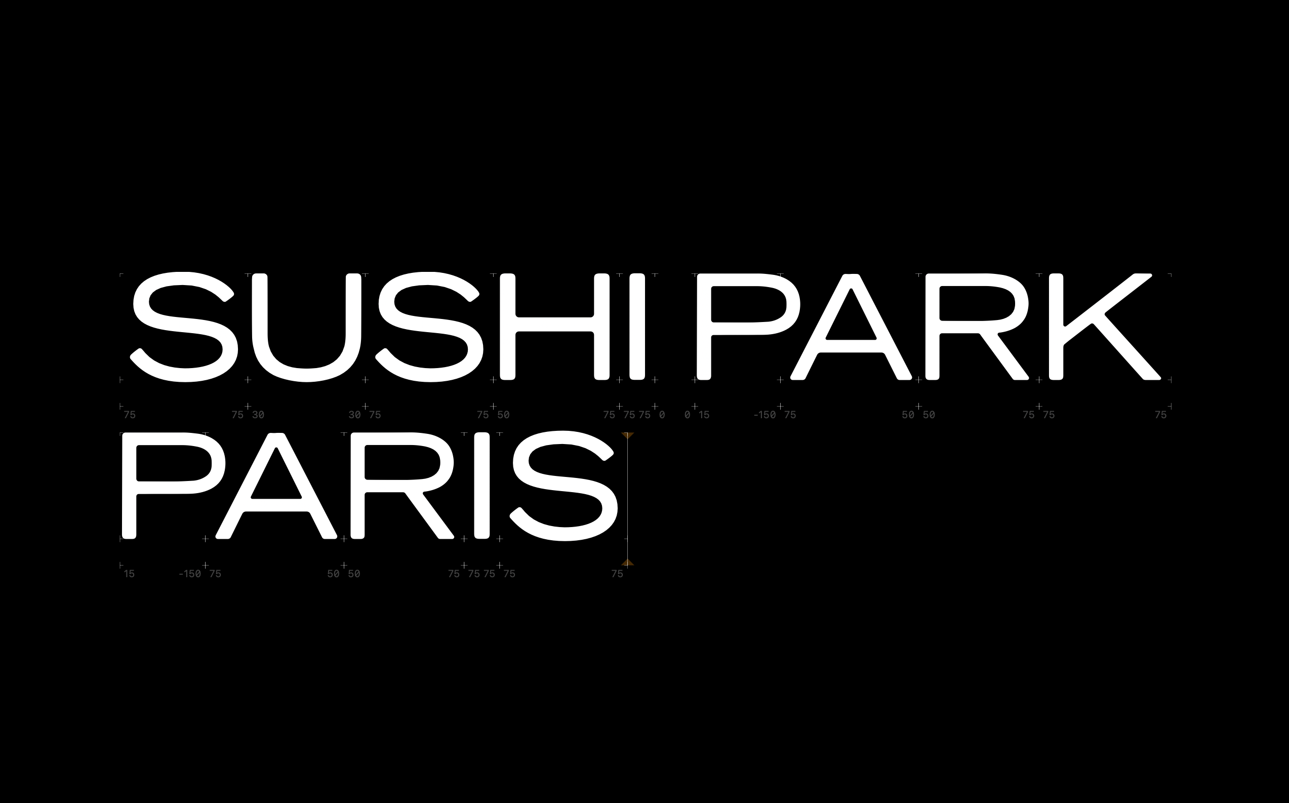
Editorial typographic spacing
The collaboration identity brings together
Sushi Park’s custom lettering
Sushi Park’s custom lettering
The reconstructed logo ensures clarity
and consistency across applications.