
This is some text inside of a div block.
This is some text inside of a div block.

This is some text inside of a div block.

This is some text inside of a div block.
This is some text inside of a div block.
This is some text inside of a div block.
This is some text inside of a div block.
This is some text inside of a div block.
This is some text inside of a div block.

This is some text inside of a div block.

This is some text inside of a div block.
This is some text inside of a div block.

This is some text inside of a div block.
This is some text inside of a div block.
This is some text inside of a div block.
This is some text inside of a div block.
04. Maison De La Reine
→ Brand Design / Campaign / Print & Digital
A fine jewellery identity translating Egyptian heritage into a language of modern royalty.

Luxury jewellery maisons often draw from historical symbolism to express prestige and lineage.
However, heritage references frequently appear as decorative motifs rather than forming the foundation of the brand language.
The project explores how cultural symbolism and typographic restraint can shape a contemporary jewellery identity.
However, heritage references frequently appear as decorative motifs rather than forming the foundation of the brand language.
The project explores how cultural symbolism and typographic restraint can shape a contemporary jewellery identity.
The concept centers on quiet royalty
authority expressed through restraint rather than ornament.
Symbolic references emerge subtly through typography and emblem.
Royal heritage → Crown-inspired emblem
Authority → Deep mineral color palette
Elegance → Serif-led typographic hierarchy
Precision → Minimal editorial layouts
Modernity → Clean graphic structure


Gold-accented palette
Deep blue and emerald tones
Legitima serif typography
Helvetica Neue secondary type
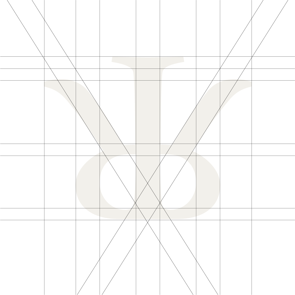
Typographic monogram emblem


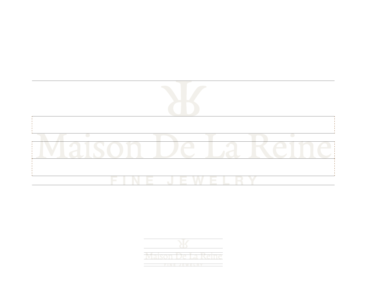
Maison de la Reine emerges as a contemporary jewellery identity
rooted in heritage and restraint.
The brand language balances symbolism with typographic precision.